The Montana Museum is not the only thing I have going these days. This one just got shipped off the other day. It’s a kitchen backsplash, on 3x6 subway tile. The bar laying on it is a yardstick, so you get an idea of the size. The yardstick is where the bottom of the range hood will be. The colors are the colors of her range and cabinets. Everybody here in the Seattle area loves this because of the new NHL team, the Kraken. But this one went off to California. Can’t wait to see it installed. I love it when a client has a truly wacky idea and has the courage to do it.
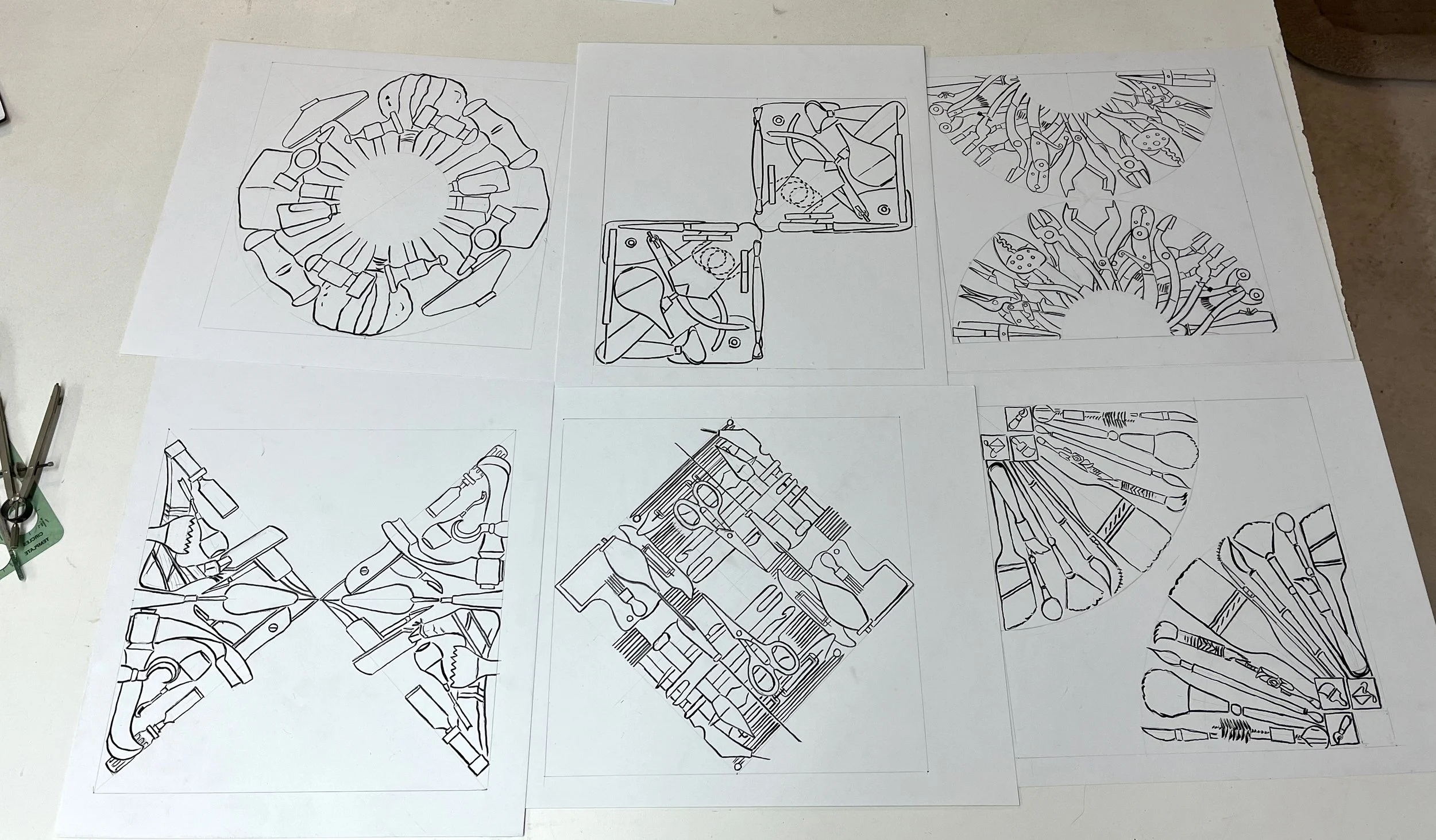
I decided to color in the drawings of all 6 of the tool designs before I started painting them on tile. I’m envisioning them a little more subtle colors than these even, and they will be on a grey background. But that’s how it goes when you’re working with colored pencils and not glazes. I did two of them with regular colored pencils and then switched to water-soluble colored pencils, so there is some difference here.
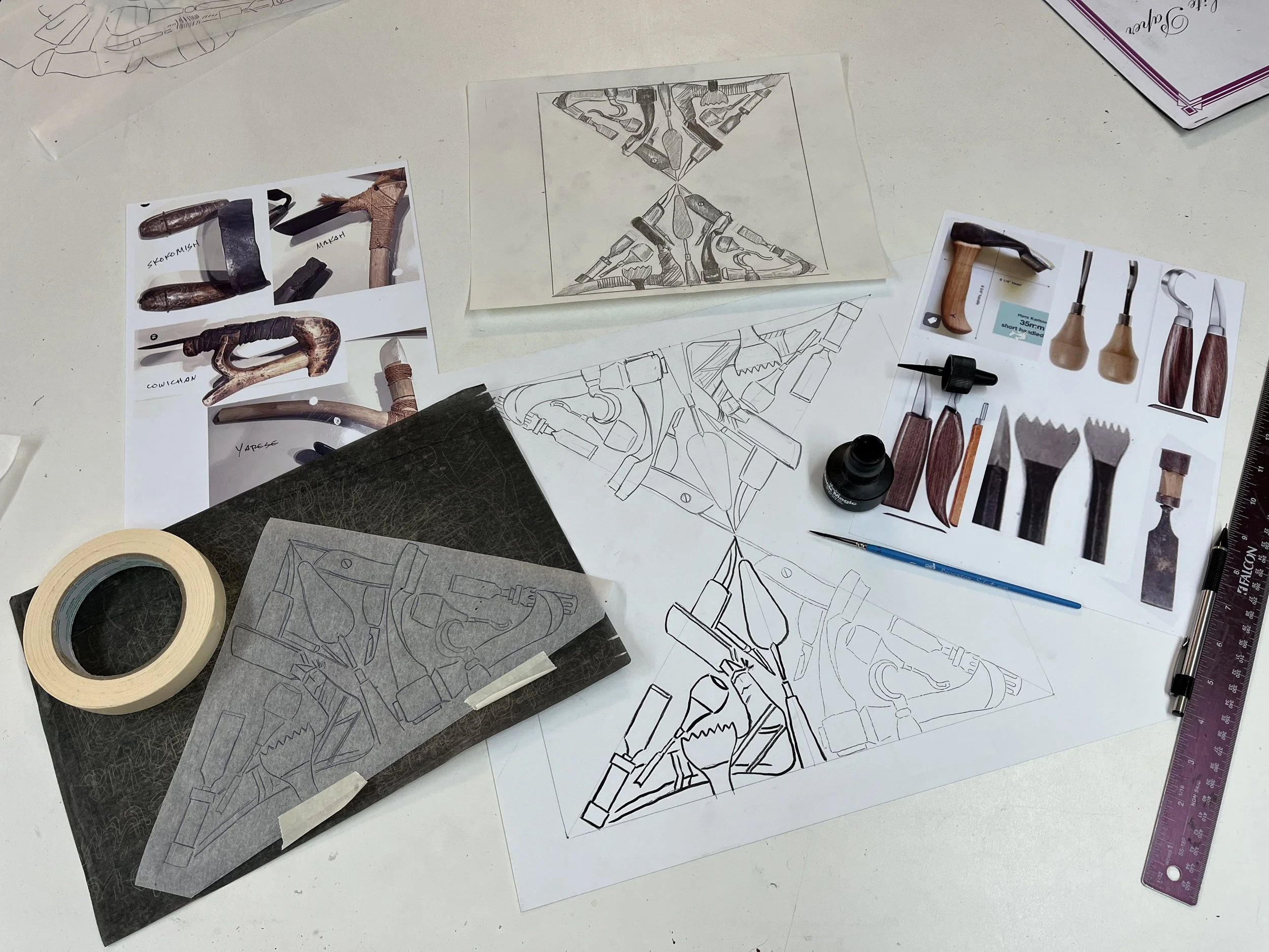
Here’s the next step. Tracing the outlines onto acetate. This is so I can transfer them to the screens and print the outlines. I could maybe have done this by having it printed at a copy place but for two problems. They only go up to 11” x 17” and these are 12”. I could have fudged most of the designs to fit, but then they never print dark enough so I have to have two copies made and lay one EXACTLY on top of the other. So I just did it by hand with acrylic paint and a really good liner brush. Didn’t take nearly as long as you’d think it would, and I enjoy that process.
Time to scale up the 8” drawings of the Tool Belt to the full 12” to put on the tiles. Here’s how it goes. Redraw the images at 12”, making any changes I decided to make from the 8” sketch, for one half of the image. Trace the image on tracing paper, then transfer to the other half with graphite paper. Go over it all with India ink and a brush. Next step: trace this onto acetate or mylar to make the stencil for the screens. I’ll probably also color these drawings in for a guide when I’m painting them. I could have had decals made of these, or I could have them printed on acetate at a print show (although there are problems with either of those) but this is about HAND work. Besides, I love this process.
Here’s how the 6 drawings of different kinds of tools will be arranged for the MT Museum of Art & Culture mural. They’ll be on 12” tiles, two rows high, so this will repeat every 3 feet. Next step is to scale them up to 12” from this 8” version, then make silk screens of the outlines to print onto the tiles.
This is the sixth and final drawing of artist’s tools for the Montana Museum of Art & Culture mural. This one was hard because so many of the tools are just sticks, or at least they’re long and skinny. So I decided to try to make it look like they were woven. Next step is to decide how the six are going to go together- in what order and what orientation each one will be in. Then it’s on to scaling these 8” drawings up to 12” and putting them onto the tile.
Here’s the next in the series of artist’s hand tools for the new Montana Museum of aArt & Culture. This one is the Blades, like palette knives, X-acto knife, matt knife, adzes, chisels and so on. One more to go.
Moving along with the MT Museum project. Here is the fourth of the 6 images, the brushes. It includes everything from a Tlingit brush to the digital commands in Photoshop and Corel Draw. I did two layouts of the brushes, and I’m going to wait to see how they work with the other 5 when I get them all done. But I’m leaning toward the one with the brushes radiating out from the corner rather than the one with them in parallel. Of the 6 images, 3 are based on dividing the square using circles, the other 3 dividing it with straight lines. So since the brushes are radiating, it feels more like it’s based on the arc.
Here’s the third of the 6 designs for my MT Museum of Art & Culture mural, “The Artist’s Tool Belt”. These are the Clippers & Grippers. I already know that on the final design, one of these will be replaced. I’m also including a shot of my drawing space as this image progressed. Above the final one, you can see 4 other variations on the theme. I thought I was going to do a design using the handles, but that didn’t work. Then I thought I’d try the whole tool, both pointing up and pointing down. I’m so old-school, and the whole point of this exercise is so much HAND tools, you can see that I actually drew the tools, cut them out, taped them down in different orders, then traced them onto the final drawings. I think these days, anybody else would have done that digitally. Not me.
This is the next design for the new Montana Museum of Art & Culture, the second of 6. This is the Clay Tools one. I had great fun getting out my clay tools and drawing them. The ear syringe is the one I’ve used for every glazed landscape I’ve done since 1973, on pots and tiles. The trowel is from a picture that Rudy Autio’s daughter sent me of the trowel that Rudy used to make all his large vessels. I think it was almost the only tool he used on them. Next up- Clippers & Grippers.


